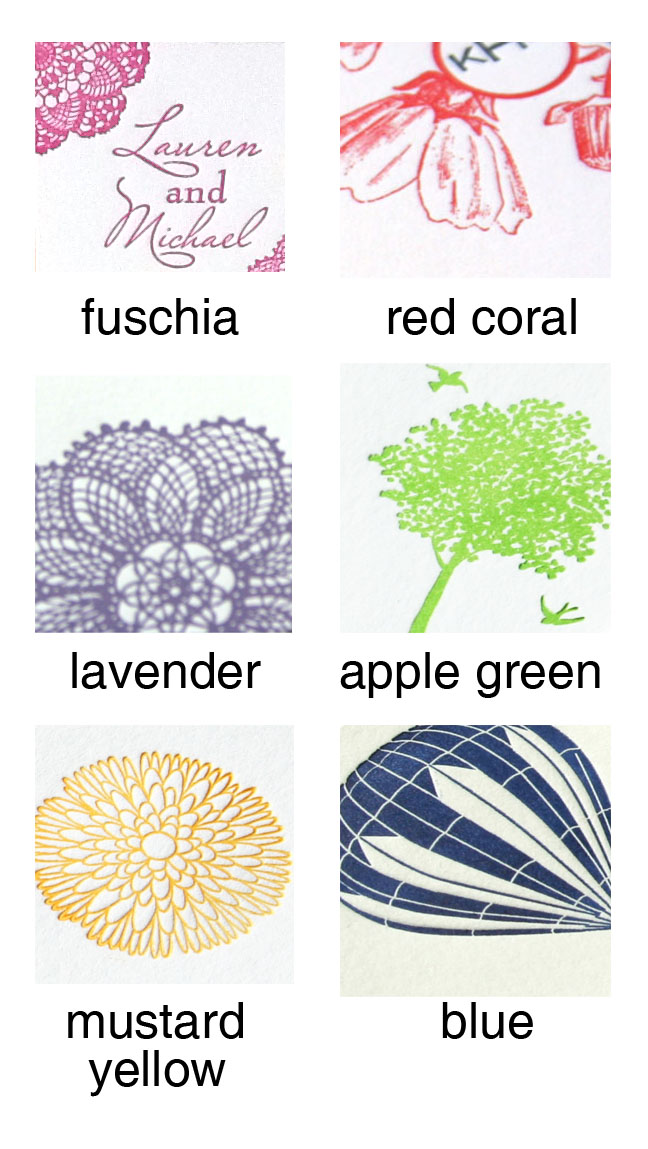
I offer my customers many different colors to choose from for their custom invitation designs. I hope this information will help you when you are communicating with me or other wedding specialists or general designers.
COLOR IS SUBJECTIVE:
1) The colors you see on your monitor may be different than the colors I see on my monitor. It is very common for monitors to be calibrated differently (I good test is to look at an image on your computer, then look at it on your smart phone or tablet and see how it compares).
2) You may see the color “mustard yellow” to be very different than how I see “mustard yellow.” There are several factors that determine perception of color: gender, the cones and rods in our eyes, lighting, a person’s age, or surrounding objects can all change the way we see colors.
3) Certain colors can be “vague.” The color “coral” for example can be an orange coral or a red coral. If you search the word “coral” on the web, you will certainly find many different shades of this color.
The point is, if you are concerned with color and have a very specific color in mind, always show your designer a sample of the color. You can mail a swatch of fabric or paper, or you can reference a pantone color. If you can meet with your designer in person, even better!
Here are some colors I have used for customers. See if you perceive each color as it is named below.


Reblogged this on thecaribbeancourt.